MAKING OF THE BOOK
“…if you can do it better, good is not good enough!”
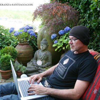
 This motto has accompanied the 46-year-old creative director, product manager and author since his earliest training as an artwork producer. For the owner of an advertising agency, precision, quality and perfection are of the utmost importance, which is why he has instilled this motto as the most important dogma in the minds of his employees.
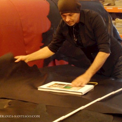
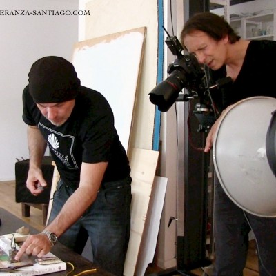
For every project, whether it’s commissioned or personal, Guido Lenssen sacrifices a few drops of his heart’s blood. With passion, dedication and personal zeal, he follows every task through to its destination and final completion. It’s not for nothing that his current agency bears the name HEARTBLOOD.
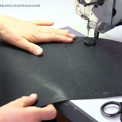
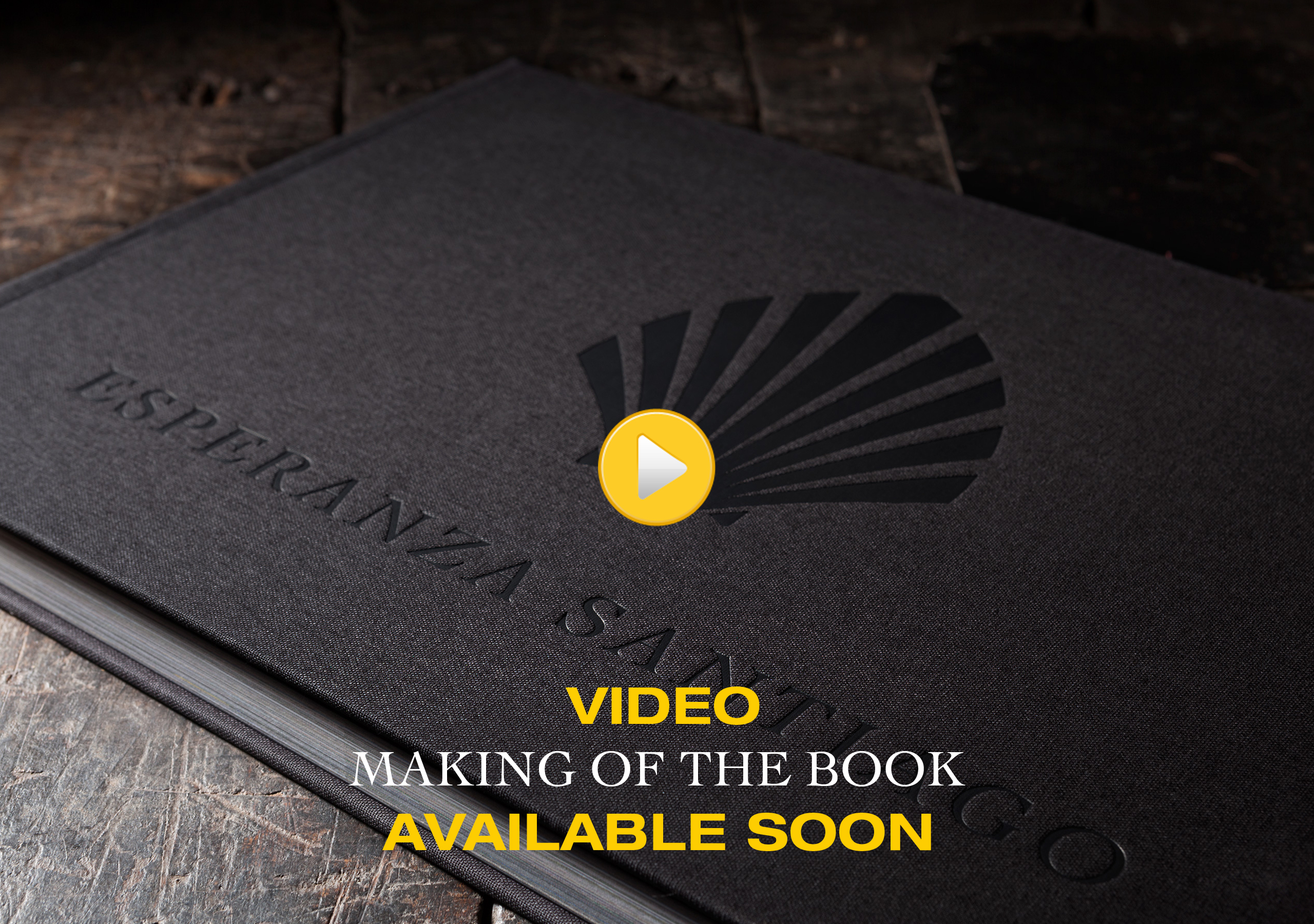
The book ESPERANZA SANTIAGO has been brought to life with precisely this passion and attention to detail. All those involved, be they translators, editors, printers or bookbinders, were briefed repeatedly and held to the highest standards of conscientiousness and precision.
But this magical book would not exist, were it not for the way in which all those involved conscientiously carried out their work, with patience and an understanding of its special nature; as if by magic.
Only in this way were we able to realise this project so completely.
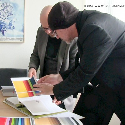
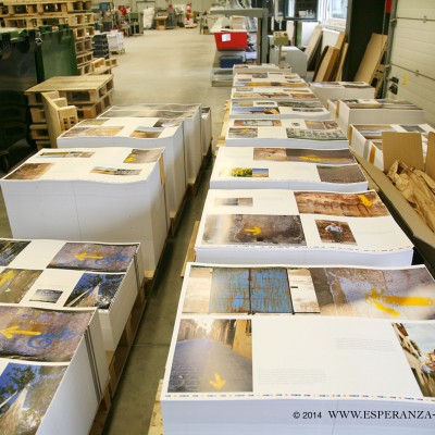
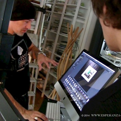
No-one other than Guido Lenssen himself could have prepared the more than 200 carefully-selected photos over many months, with obsession and zeal, until they were flawless and ready for printing. No lithography studio in the world could have translated his personal colour impressions so truly into reality. Images with difficult-to-translate colours and impressions were repeatedly printed to ensure that the colouration on the screen was really transferred to the page. In this process the smallest nuances, almost invisible to the naked eye, took on great significance and, if necessary, were corrected.
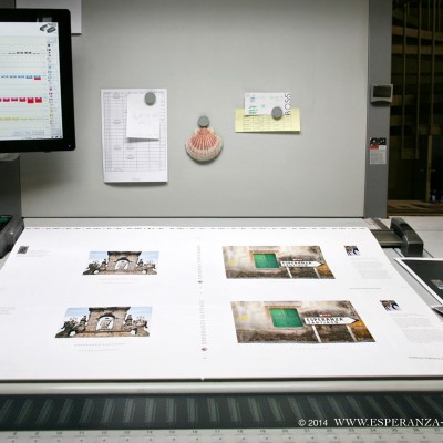
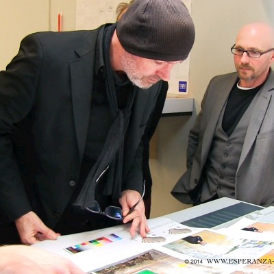
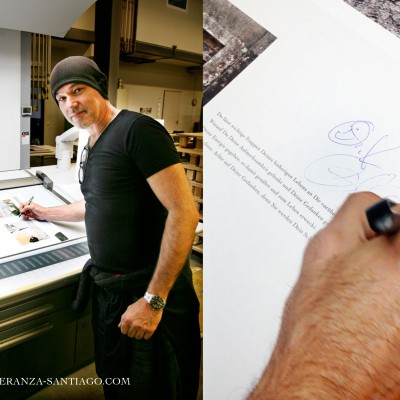
 Only the best printing press on the market, the largest and most expensive Heidelberg, was good enough to print the book. Also during the printing process Guido Lenssen left nothing to chance, watching over every printed sheet with eagle eyes for three days and nights. Each individual image had to receive his personal seal of approval. The trained graphic artist personally carried out small colour corrections at the printing press, and energetically intervened when he felt that a printing plate needed to be changed, or in the worst case, an image needed to be re-worked.
When selecting translators to work on the text, various test translations were used to select the translator for each language who best identified with the book’s content. Each translator had to be able to convey the spiritual theme of the book without exerting a personal influence on its content.
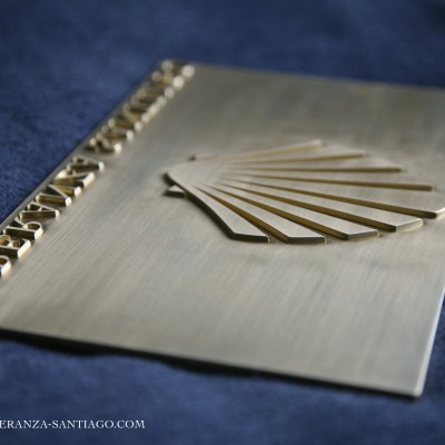
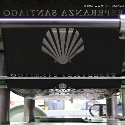
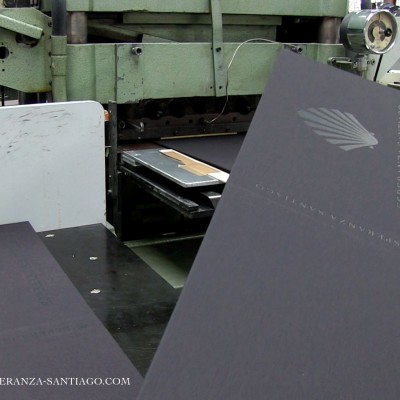
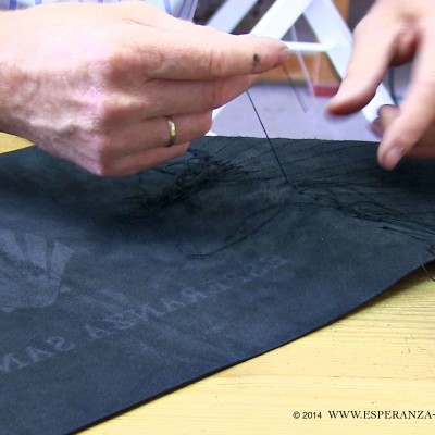
The template for the stamping press was measured to the millimetre and precisely inserted by the bookbinder. Here, too, Lenssen examined every handle and gave it his blessing.
The biggest challenge for the creative director, however, was finding a print company that would produce the desired 25×37 cm format at a reasonable price, and that had the appropriate printing machinery. Again, Lenssen spared no effort in finding the right partner for his book, not budging a millimetre on his desired format.
It cannot have been a coincidence that, after a long search, the surname of the selected printer’s sales representative was “Jakob”, and the receptionist’s name was “Mrs. Jakobs”.
